The Oppia Foundation is a nonprofit company focused on providing quality education to those who lack access to it. Education, learnability, and accessibility are their key goals!


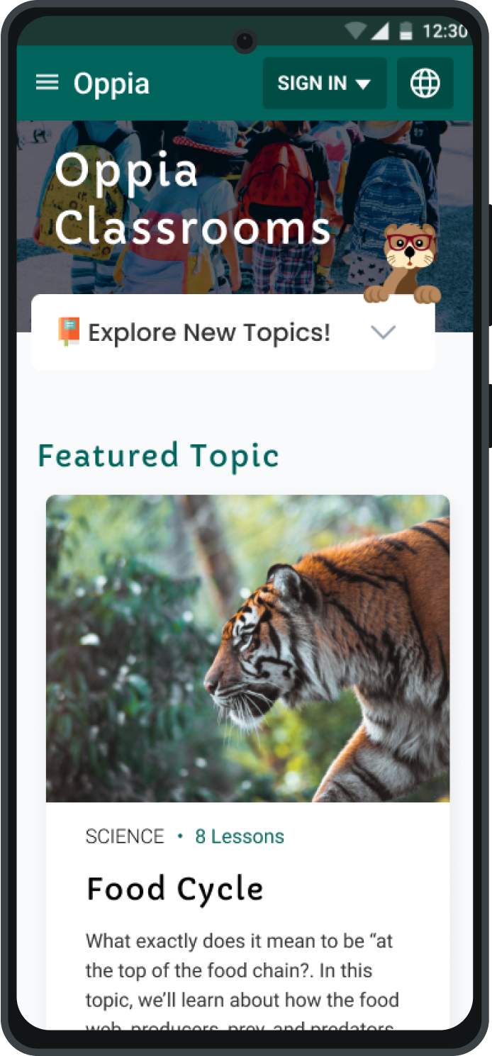


I was assigned to create a “multiple classrooms page” that would host the main content within Oppia. A critical part of this project was encouraging students to explore the available topics and lessons included. It would act as the centralized hub of all the content there is to offer.

I created an experience featuring topics and lessons that provided a preview of each class with exciting visuals and straightforward navigation.
This project is currently under the final rounds of research tests to validate the effectiveness of the new designs.


Oppia’s reach ranges from the Americas, West Africa, India, and many other places worldwide.
Before I made any moves to come up with ideas for a classroom hub page, I needed to have a clear vision of what my objective was.
Create a design that provides the most efficient flow from users first landing on Oppia to finding a topic or class that interests them.
By writing down and reiterating what my objective was, I was able to create clear goals in mind for the research and design:

My priority was establishing what kinds of users would be utilizing the dashboard. While I had a general idea, I needed a complete understanding of how to gauge the accessibility requirements.
To kickstart some of the ideas I had circulating from the user clarification, I created low-fidelity mocks to share with my colleagues.


After reviewing the defined audience and building wireframes, I began to run into a wall when brainstorming potential solutions. One of the focus areas of the design was accessibility, but another was interactivity and immersion.
To solve for these challenges I was facing, I created a full research plan document and guide for other researchers to be able to use and collaborate with. This is where I begin conducting competitive analysis.
Conducting competitive analysis was beneficial to understanding what makes content pages work.
I analyzed sites like Brilliant, Khan Academy, Skill-Share, and more.
What layouts, features, or patterns are users most familiar with on these other sites?
What is the general flow from arriving on one of these sites to signing up or beginning a course?
What are other educational platforms prioritizing when it comes to content?


I experimented with different layouts and forms of the content to explore options; however, none of them embodied the interactivity and clarity I was looking for.
I used the SWOT method where I would analyze Strengths, Weaknesses, Opportunities, and Threats to gauge heuristic evaluation.


Heuristic evaluation of the competitive analysis helped to break the mold I was stuck in for design ideas. I could take their strengths, weaknesses, and opportunities to make critical design decisions.
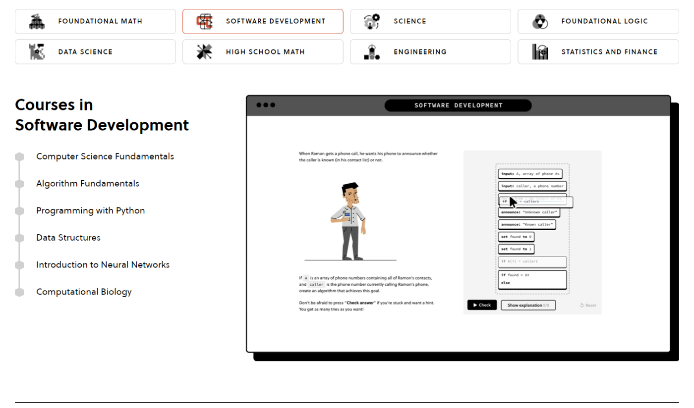
Simplify topic cards and showcase sufficient information to inform the user's decision on what class to choose.
Many card designs featured the number of lessons, associated class, or a tag. The designs had to be tested to evaluate which information was helpful.


Prioritize information from the class having the main focus and the topics as supporting text and visuals for the class.
I experimented with multiple layouts, including grids, fixed scroll, and full-page layouts!

Minimize obstructions between the user and clicking into a class. Provide an efficient pathway to the class at all times.
This can be seen with the “view classroom” button in multiple instances of the class views.


Heuristic evaluation of the competitive analysis helped to break the mold I was stuck in for design ideas. I could take their strengths, weaknesses, and opportunities to make critical design decisions.


I created a user flow to help visually map out each decisions the user would have to make when coming across the classrooms page.

According to Jakob’s law, users spend most of their time on other platforms creating a set of expectations.
A featured section will aid in providing familiarity with the structure of the multiple classrooms page. A "featured" component indicates that it's just one of the other potential sections of content the users can explore.

I created a prototype and set of high-fidelity mocks for use in usabaility testing to validate the effectiveness of the design.


This project is entering its final research stages with a usability test of these newly created mocks. The team received them well, and the page had come a long way from its origins. Further results and iterations will be coming in the next month!


