Trakabee is a mobile app designed for users to log their daily foods and symptoms to find potential allergens.


Although the app’s tracking feature and log were functional, the final results experience needed to be designed.
With the end goal of the app being to help users identify potential allergens from the foods they’ve logged, there would need to be a clear pathway to that goal.

My team and I wanted to emphasize that the user’s daily time and effort logging their foods and symptoms was sure to reward them.
We designed a new logging experience switching from the original logs to a timeline where they could view their progress first-hand. I developed a graph capable of displaying all the symptom info a user has about any food they’ve ever logged!
Trackers saw more engagement with a 40% increase in app downloads in January 2021 and a 22% increase in log activity.


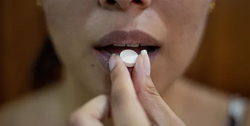
Each year in the U.S., 200,000 people require emergency medical care for allergic reactions to food according to FARE.
Understanding and empathizing with users who had allergies was essential to get the most out of the results.
Our client, Kat Dykes, the creator of Trakabee, testified to going through several years of on and off allergic reactions. She and other users I interviewed later on expressed frustration and fatigue having to be careful of every food they came into contact with.
To learn more, I conducted user interviews and usability tests to learn more about the tracking process and empathize with what they were experiencing. I set goals to aid in guiding the research and hoped to find out:
After the interviews, I would reach back out to the interviewees if they would’ve liked to participate in the development and design of Trakabee. Thirteen came back out.


8 of 13 the individuals we interviewed said that the time it took from tracking to recieving results was the most important factor.


With users valuing time and accuracy over everything, we needed to provide a flow that focused on providing skimmable information.
This would require altering the currently existing log and tracking process to accomadate the graph that would be implemented.
Creating a user flow allowed my team and I to map out the journey for the user and pinpoint what critical areas would need the most attention given our time frame.

I developed a persona to encompass the users’ needs and build with their pain points in mind.

With users valuing time and accuracy over everything, we needed to provide a flow focused on providing skimmable information.
This would require altering the current log and tracking process to accommodate the graph I would implement.
For this journey phase, I focused on implementing changes/additions that improved overall usability to increase user retention.
Motivation and encouragement were vital components to the success of those that logged their symptoms. I wanted the users to feel like they were being rewarded for the time and effort that they put into the app.
The first update to the existing design was modifying the log into a timeline. The timeline included both the listed symptoms and triggers for each logged date.
The benefit of this change is allowing users to view the days they missed and encouraging them to complete each dot (day) on the timeline.


One element we didn't quite finish for the project's final weeks was the results display page. It took a few more iterations on the original ideas my team, and I came up with until we decided to focus on developing the graph.
Many options were usability tested with the users I previously interviewed. Still, unfortunately, most of the graphs weren't easy to understand. The main concerns were:

After the feedback from the previous graph designs, I looked to Google’s Material Design for aid. The section on data visualization guided the correlation and flow of data.
The #3 donut graph was the key to visualizing the symptom represented through the logged foods/triggers.


After the feedback from the previous graph designs, I looked to Google’s Material Design for aid. The section on data visualization guided the correlation and flow of data.
The #3 donut graph was the key to visualizing the symptom represented through the logged foods/triggers.

The new additions of the timeline, note editing, and Graph 3.0 have received great feedback from our continued testers.
Trackers saw more engagement with a 40% increase in app downloads in January 2021 and a 22% increase in log activity.
My work on this project wouldn't have been possible without my team and the incredible volunteers in the interviews and testing!


This was my first actual UX project, and it was the most informative in going through my UX boot camp. I learned how to collaborate with others and receive feedback productively and healthily to improve my work.
It was an incredible experience to work with the volunteers who tested and interviewed us. This allowed me to empathize with who I was creating for and see first-hand what kinds of goals they had, what motivated them, and their struggles in attaining those goals.
It’s influenced who I am today, not only as a designer but as a person that values emotional endurance and the fresh perspectives of others!

